Part of the reason why we dedicate so many hours to running around the many magical regions in the Pokémon games, grinding out battles against endless trainers, is because we all love Pokémon evolutions. When you hear that iconic evolution music start to play (after the satisfying ‘ding’ of a level-up) a sense of giddy excitement hits you every time.
Pokémon evolutions make our Poké-friends stronger, give them access to new moves, and also help to bulk out that all-important Pokédex. Sometimes, they even change the Pokémon’s type. Most importantly though, when a Pokémon evolves it almost always gets significantly cooler. Almost.
Let’s be honest: a Wartortle is just better than a Squirtle in every conceivable way (unless that Squirtle is a part of the super snazzy Squirtle Squad). An Ariados is always more impressive than a Spinarak. A Gliscor is an undeniable improvement on a Gligar. However, there are exceptions to the rule. Sometimes, every now and then, a Pokémon evolution is a major downgrade. So whether it’s down to simple aesthetics or even just vibes, here are the Pokémon evolutions that make the ‘mons worse.
Weepinbell
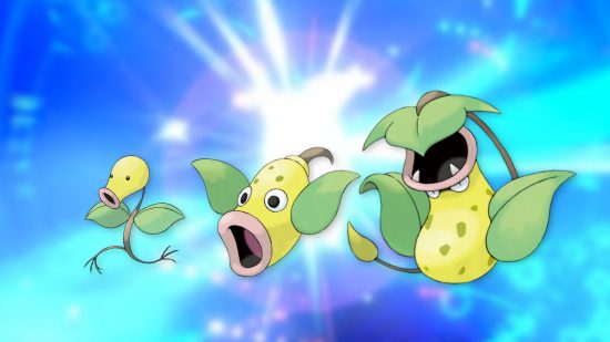
I have nothing against Weepinbell in particular: I quite like it actually. The issue is that it loses what we love so much about Bellsprout.
I fully admit that Bellsprout isn’t the most popular Pokémon, but that’s a major oversight. Bellsprout might be one of the cutest things I’ve ever seen, and I would defend it with my life. Weepinbell just doesn’t evoke the same feelings. I don’t dislike the design, but a floating trumpet is simply never going to be as iconic as a tiny walking stem with roots for feet.
Gengar
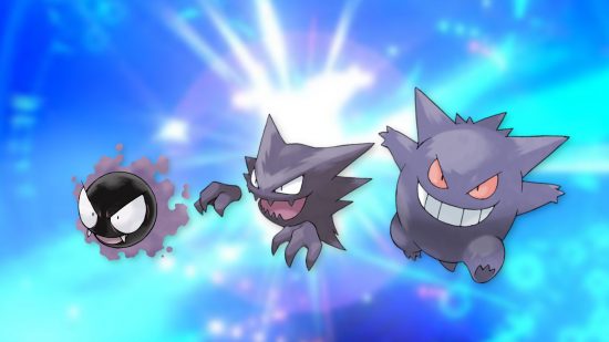
Cue the controversy: Haunter is better than Gengar. With its crooked smile, spiky teeth, and detached hands, Haunter looks genuinely evil. But with its evolution to Gengar, that menace gets lost somewhere along the way. A lot of that comes down to the addition of legs. Those legs ground Gengar making the gen 1 Pokémon much more cheeky, but a lot less spooky too. We all want our ghost Pokémon to be spooky.
Xatu
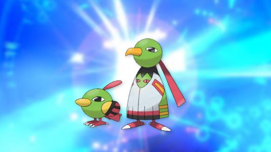
Natu was loving life, hopping along and being an all-around chill dude. Then, Xatu had to come along and ruin the fun. Xatu is a flying Pokémon, but its upright design makes it look stiff and awkward. The evolution for Natu should have doubled down on the fact that this Pokémon was a small, carefree thing, and Xatu simply looks too serious. I’d love to hang out with Natu, but Xatu is clearly a vibe-killer.
Shiftry
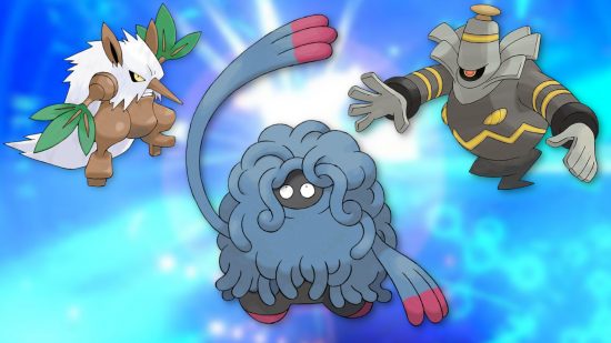
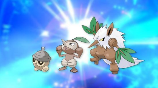
Shiftry has a very unique Pokémon evolution line, because all three of them are so different. Seedot is like a sweet fallen acorn, Nuzleaf gets facial features and arms, and Shiftry becomes an unfriendly bush. Unfortunately, that unfriendly bush is a downgrade to both of its predecessors.
Seedot and Nuzleaf are so distinctive: there aren’t any Pokémon that look anything like either of them. Shiftry takes that distinctiveness and throws it in the bin. It’s just your standard bipedal Pokémon now: like Snover, but without the snow.
Camerupt
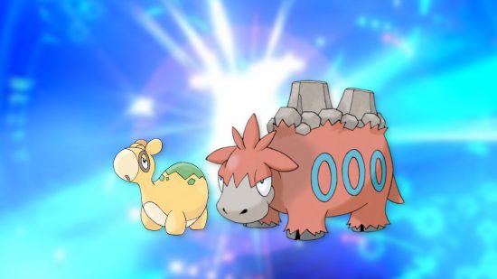
Numel is a squishy, cuddly little fellow who looks like it wants nothing more than a long, comfortable nap. Sadly, Camerupt has to come along and ruin it all. While I want to give Numel a nice stroke on the head, Camerupt would bite my hand off without a second thought. You just don’t want to go anywhere near it, and it’s swapped Numel’s peaceful dopeyness for an unnecessary sense of aggression.
Dusclops
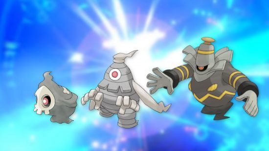
Duskull isn’t a particularly impressive or distinctive Pokemon. It takes some inspiration from Ghastly, but a far less expressive face means it also has a lot less personality. Still, it’s mostly fine, and that single glowing orb behind the sockets of its skull mask is cool.
So, when I look at Dusclops I have so many questions, and none of them are positive. Why does it have a stupid little hat? Why does it have those ribbons flowing behind it? Why does it have those horrible grabby hands? The truth is, Dusclops looks like a tent that hasn’t been put up right. It’s flappy, and creepy (not in a good way), making it a significant downgrade on Duskull.
Lickilicky
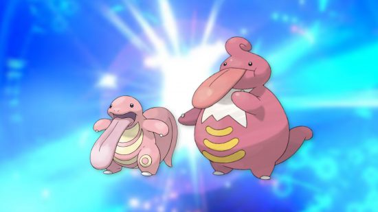
Where do you even start with Lickilicky? Why does it have an Elvis Prestley quiff? Why is it suddenly some kind of aristocrat? Why has it become so much more human-looking? I would be able to get over each of those flaws if it wasn’t for the fact that the design for Lickiilicky shrinks the tongue so much.
Lickitung’s own tongue is basically dragging along the floor, and the evolution should have made it even bigger, and even more uncontrollable, rather than reducing its best feature.
Rhyperior
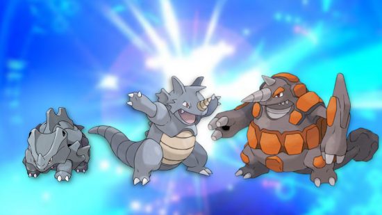
Rhyperior is a completely ridiculous Pokémon. And before you say it, I know: plenty of Pokémon are ridiculous. I’ve seen Buzzwole (unfortunately). The issue with Rhyperior is that it takes a perfect Pokémon, Rhydon, and turns it into something laughable.
Rhydon is a total badass, but Rhyperior just looks like a bad Transformer. Deciding to make it so round was a big mistake, because even with its enlarged size, it no longer looks threatening.
Tangrowth
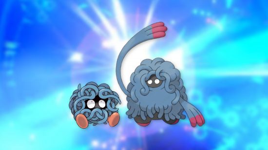
Tangela is, quite frankly, charming. Those big eyes and goofy red feet are just adorable. There’s also an element of mystery: what would Tangela look like if you unravelled all those vines? Instead of answering that question Tangrowth just makes Tangela bigger, and it loses all of its charm.
Tangrowth is a large, cumbersome, gangly thing. While you definitely want Tangela wandering alongside you as a travelling companion (it’s seriously cute), if you saw a Tangrowth walking towards you, you’d be terrified. The biggest issue is the arms. For some reason, they make Tangrowth extremely intimidating and kind of gross.
Emboar
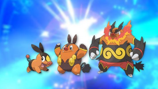
Notably, Emboar is the only starter Pokémon on the list. The vast majority of starters just get cooler and cooler as they evolve, and they’re all some of the best Pokémon out of each generation. Then, there’s Emboar.
Pignite was perfect as it was, with a distinctive shape and personality. Unfortunately, Emboar is just an orange cube, and while the addition of all that fire (and the new pattern across its stomach) is meant to be impressive, it backfires. Embaor is trying too hard and Pignite was always effortlessly cool.
That’s it for now on the Pokémon evolutions which are downgrades. It might be a controversial list, but someone had to do it. For more take a look at our list of the best gen 2 Pokémon, gen 3 Pokémon, and gen 4 Pokémon.
