In cities, colour is everywhere.
Buildings show off their contours with contrasting pops of colour, while public spaces come to life with art installations, people, and programming. Commercial strips are lined with patios that flaunt all sorts of colourful paraphernalia from umbrellas to greenery to – well, the food and beverages themselves – both vivid and delicious. In the winter, our main streets are illuminated with playful lighting arrangements – string lights wrapped around trees or hoisted, almost levitating above light standards – adding much-needed warmth and vibrancy in our colder, darker months of the year. During the festive season, you might even see a neon red-nosed reindeer.

The point is this – colour is woven like a tapestry throughout our urban landscapes. Yet, how often do we sit back and reflect on their impact and importance in our cities?
Especially in often muted and monochromatic winter landscapes, and in colder cities like Edmonton, colour is critical and can animate and breathe life into public and private spaces. It can add liveliness to deteriorating or vacant storefronts, often drab and dull building exteriors that need a desperate pick-me-up.
Colour can create a sense of identity, marking a place or drawing attention to something. Colour can be used to signal a city’s identity. Colour can play a role in how we experience a space – often prompting emotional responses and feelings of joy and excitement. Colour can be applied in rather inexpensive ways, too, with a can of paint.
Edmonton’s city builders, whether elected or municipal officials, residents, community organizations, or developers, are using the city as a canvas – leveraging colour to express culture, to create spaces that invite and celebrate difference, and to illustrate the city’s unique identity.
Celebrating culture
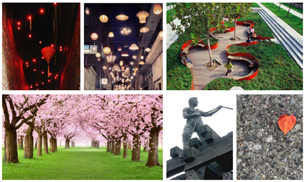
Station Lands, a $1.2 billion mixed-use residential and commercial development, on the historic former Canadian National railyard site downtown, proposes a dynamic, immersive public space – that will serve not only the needs of residents and future tenants but will also be culturally sensitive to the surrounding communities. With expertise in community building and mixed-use development, Qualico Properties is advancing a master-planned community where apartments, town homes, street-level retail, a large public plaza and other amenities all come together.
Mike Saunders, Senior Vice President of Qualico Properties, said that engagement with the many stakeholders from within the adjacent communities played a foundational role in the planning and design of the project’s public space. Specifically, its location presents a unique opportunity to redefine the character and function of downtown’s northeast quadrant in a way that creates synergy with the developing neighbourhoods of the surrounding area.
As colour can often have religious or cultural associations, Saunders noted the importance of engaging with the community to be appropriate and respectful.
“For example, we worked with the Chinese community to embed cultural considerations in our development,” said Saunders, “where we will look to incorporate pops of pink through the use of cherry blossoms trees and lighting through the use of red lanterns into our public realm design.”
On Jasper Avenue, a former lot that housed the Canadian National Institute for the Blind was recently redeveloped into Citizen on Jasper, a 33-storey building with 344 purpose-built rental units.
The developer, ONE Properties, was intentional about colour selection.
“Colour can create structures that become landmarks, contributing to a city’s cultural richness,” said Lindsay Dyck, Design and Development Manager at ONE Properties. “We strategically employed colour to enhance both the building’s functionality and its connection to the community.”
The building uses colour as part of vertical lighting to create a dynamic and striking visual element. As the colours change, it adds to the nighttime skyline while serving as a point of reference and recognition for residents and visitors alike.


“Most importantly, we added colour into the vertical fins that flake the retail podium on both the south and east elevations,” Dyck added. “What makes this design special is that they incorporate simulated braille, paying homage to the history of the site – adding an element of cultural inclusivity.”
Making space
In Edmonton, murals and public art have become a permanent paintbrush for the community.
This year, the Edmonton Downtown Business Association (EDBA) hosted its second edition of Downtown Spark, an event that added whimsical art installations to the downtown.
From giant bubbles that added a light, effervescent champagne-like clink to an underutilized courtyard to giant inflatable monsters climbing like Godzilla on office towers – art can add splashes of colour to the city. The association also uplifted otherwise underused alleyways into lively people-places, as part of their Alley of Light and Lulu Lane initiatives.
“Pops of colour, especially where they’re unexpected, create these wonderful little moments of surprise and delight,” said Puneeta McBryan, Executive Director of the EDBA.
“We need our downtowns to be fun and joyful places to explore, and in Edmonton, our Downtown Spark and our downtown alley transformations are some of the ways we’ve introduced vibrant colours and added whimsy to spaces that were quite monochromatic and uninteresting.”


Nestled in a small part of downtown, Michael Phair Park, designed by HCMA, named in recognition of Michael Phair, the first openly gay politician in Alberta, received a visual treatment in the form of colourful confetti.

The mural serves as both a form of resistance and community commentary – that Edmonton is a city that celebrates diversity in all its forms, centres queer expression and joy, and advocates for the full and equitable participation of everyone. In the summer, it became the site for dynamic programming, featuring drag performances and musicians.
“Colour can promote a sense of community ownership and pride, and signal solidarity with marginalized communities,” said Phair. “By adding confetti to the park, we made our downtown more inviting and accessible – a place for everyone.”
Creating a sense of place through colour can enable people to gather, connect, and stay in an area for longer periods of time, fostering community and social cohesion, explained Andy Lucardie of Pinpoint, a brand and environmental graphic design consulting firm commissioned to lead the environmental graphic program of Station Lands.
“Colour can be an inexpensive yet punchy, impactful solution for urban projects,” said Lucardie. “Unique and vibrant murals, use of vibrant paint colours, green spaces, play spaces, exclusive walkable streets bathed in creative lighting can become distinctive Edmonton features.”
Working collaboratively with staff with a range of identity factors, those with disabilities, Indigenous peoples, racialized individuals, and people from the 2SLGBTQ community, Stantec collaborated with the City of Edmonton to transform an asphalt street into a kaleidoscope of colour.
“The representation of our teams who represent a wide range of backgrounds and abilities made the project deeply meaningful,” said Eric Decorby, an engineering project manager at Stantec, who led the initiative. “So much of our downtown infrastructure is dull concrete, so paint is an easy and affordable way to make a substantial impact. What made it more impactful was how employee-led this initiative was, and showed how the private sector can play a role in beautifying and animating the city.”

(Way)finding our identity
Colour can play a significant role in creating a sense of arrival and neighbourhood identity.
For Kelso Brennan, the Managing Director of Hi Signs, colour can help people understand where they are in the city. At Rivers Edge, a community developed by Qualico Communities, Brennan and his team developed a sign to serve as a warm welcome to the area.
“Qualico was looking to create an entrance feature that would simulate a tide,” Brennan explained. Made of custom acrylic, the sign utilizes subtle paint transitions – from teal to light blue.
“When it hits the light, it looks like water,” Kelso said.


Developed by Autograph and designed by Hodgson Schilf Evans Architects Inc. (HSEA), Mercury Block features a 180 ft. by 63 ft. mural along its west building façade.
“Our intention is to infuse the surrounding cityscape with a burst of colour and energy,” said Ian Evans, Principal of HSEA. “The building in its own way serves as a canvas that reflects the character of the Oliver community and contributes to a sense of place and community identity.”


Within the courtyard, a bright red staircase provides a striking architectural element to balance the building’s black exterior. A glass railing on 102 Avenue comes alive with colours that dance across the transparent panels, infusing the façade with a dynamic and eye-catching appeal.
“This creative use of colour engages pedestrians, transforming the railing into an artful focal point,” added Evans.
Colour me surprised
These examples paint especially important lessons for cities and those who shape and build the spaces and places within them – that colour is essential for enhancing aesthetics, improving well-being, reflecting identity, aiding in wayfinding, and contributing to revitalization.
For Katie Sutherland, Creative Lead at Hi Signs, colour can be added in a city through a dynamic palette of materials.

“Colour isn’t just paint – it can be light, different types of wood, trees, and landscape,” she said. “We work with clients to choose the right materials that can evoke warmth, are modern, and that strike a balance between what’s on trend and timelessness.”
Sutherland spoke to the challenges associated with colour matching and translating brand colours in the fabrication process, and how certain colours can become washed-out or do not illuminate well when built.
“Without a pantone value, which is a universal system, it can be difficult to process signage for our developer clients.”
For Evans, his team and architectural practice leverages 3D modelling and renderings to immerse themselves in their designs and envisioned streetscapes – to see how colourful ideas look.
“Colour is infused in our planning and design process through a dual approach of addition and subtraction,” he said. “Our approach enables us to tangibly feel the atmosphere and swiftly experiment with various combinations and applications, ensuring that the final outcome is both visually captivating and emotionally resonant.”
Being intentional with colour is a priority, too, of Dyck and ONE Properties.
“Adding colour to a project is a thoughtful, collaborative, and strategic process,” said Dyck. “It is not just about choosing colours randomly. It is about considering the project’s goals, aesthetics, functionality, and the emotions that you want to evoke.”
Colour shows up in our cities in so many ways – our buildings, public spaces, and the places in between. In Edmonton, colour is a multifaceted element and tool in our built environment and communities – that serve aesthetic, functional, emotional, cultural, and practical purposes. Colour even shows up in the maps of our land use bylaws to delineate zones and land uses. And in prairie cities, where land is vast and the horizon is far, and when winter can create a dull grey appearance – colour is important. As kids, we are told to colour within the lines – but as adults, in cities, the goal should be to colour outside the margins.


Jason Syvixay is Urban Development Institute – Edmonton Metro’s Director of Metro Strategy and Advocacy. He is a national award-winning registered professional planner and PhD candidate who has led policy and programs related to infill, zoning, downtown, and equity.