In a Walmart parking lot north of Toronto, a turtle shell-shaped canopy balances atop the Vaughan Metropolitan Centre subway station. An artwork by Paul Raff, MRAIC made of mirror-polished steel panels covers the ceiling, reflecting the warm glow of passengers below. Pierced by a series of blue skylights, the ceiling is like a 21st-century Ronchamp. The dramatic entrance shelters commuters and houses a pair of heroic staircases that provide access to the northern terminus of the Toronto-York Spadina Subway extension.

The station is part of a $3.2-billion infrastructure project, including six new stations, that brings a subway connection to Toronto’s outer suburbs for the first time. Since the project launched in late 2017, critics have been quick to share their opinions. Some have questioned the political horse-trading involved in choosing station locations. Others have dismissed the stations as white elephants that serve too few people.
Given the significant level of investment, it seems fair to ask: How is the line delivering on its promise of dignified mobility for all segments of our population? And how might the stations support this goal as the surrounding areas develop over time?

The design of transit stations is a complex undertaking—one that aims to balance the functional needs of mobility with the desire to elevate the passenger experience, while also integrating with the surrounding context and supporting development. With their hefty budgets and long time-horizons, these projects also attract political attention, adding layers of complexity to the design process.
Toronto has responded to this challenge variously. The original Yonge and Bloor subway lines prioritized function, and broadcast these values through a consistent, streamlined aesthetic. In contrast, the Spadina line, whose generous stations were designed by Arthur Erickson and others, reflected the exuberance and expressionism of Canada’s Centennial. The Sheppard line, in turn, registered the dour parsimoniousness of the 1990s recession in its concrete and steel stations.

The Spadina Extension takes an approach that aims to split the difference. Platform elements, wayfinding and site furnishings have been standardized, while station designs have been assigned to individual architects and respond to their local context. This is the same approach employed by London’s Crossrail and Vancouver’s Millennium Line. In comparison, Toronto’s Crosstown LRT and Montreal’s REM LRT networks, both in progress, are aiming for a more consistent line-wide identity.
Travelling the new subway extension in Toronto, one immediately notices the exposed concrete station box walls at the platform level. Common to all stations, the ad-free walls are home to station identification signage that employs the Toronto Subway font (designed for the original network and recently resurrected), providing a clear visual connection to the city’s early subways.

Common elements employed across all stations also include robustly detailed terrazzo floors, platform-edge lighting, and granite stair treads that can be replaced after they inevitably disintegrate from winter salting. Red, pre-finished metal boxes and niches of various scales are another nod to Toronto Transit Commission’s legacy brand with its red logo and red streetcars. The enclosures house necessities such as fare collectors’ rooms, recycling bins, benches and pay phones. Together, these elements provide a coherent aesthetic to station amenities that acknowledges their antecedents.
The approach to standardization of site furnishings is, unfortunately, less than the sum of its parts. Best practices in contemporary station design have been deployed throughout the line—covered bike parking, landscaped pedestrian allées, and high-quality paving. But in several sites, this is spread out across an expanse of surface parking that subverts good intentions. At the Highway 407 station, bike racks sit empty, seemingly placed there by a forlorn cargo cult hoping to attract urbanity to a hydro-electric corridor. Cheap green plastic salt storage bins have already attached themselves to station entrances. Beyond the platforms, standardized elements give way to stations that are each unique expressions of civic infrastructure, bringing a level of dignity to the daily pilgrimage of their users.

The York University and Finch West stations are the busiest along the extension, but they couldn’t be more different. Designed by Foster + Partners with Adamson Associates and Arup, York University is cool, sober, symmetrical, curving and sleek, while the Alsop (now aLL) and IBI-designed Finch West is a heavy, rectilinear, riotous explosion of rainbow colours.
The York University station displaced over 1,400 daily bus trips that descended on the campus—a large number for the previous bus drop-off area, but a relatively small number for a subway. For much of the day, this results in an eerie quiet when you arrive. Sitting low to the ground, the boomerang-shaped station frames the eastern edge of the campus’s central quad without overpowering it, and introduces a moment of transparency along its main axis. A sunken amphitheatre sits in the elbow of the boomerang (sadly, it is closed to the public), while a vehicular layby is neatly tucked along the perimeter. Impeccable concrete work and refined detailing reflect an acute attention to detail. The rigid symmetry, central stair and consolidated fare gates make for a clear composition, although unfortunately, they result in a circuitous path for passengers requiring mobility devices.

Relatively modest when compared to other stations along the line, the Finch West station delivers valuable moments of delight to passengers. Working with artist Bruce McLean, the designers developed expressive concrete canopies and columns that suggest contemporary caryatids. Black-and-white barcode-like patterning on the exterior gives way to tinted skylights, tiles and glass panels that dapple the interiors with colours.

A large double-height space over the platform expands the interiors and signals connections to the future Finch West LRT, which will be accessible from the station. Property constraints forced the designers to integrate a traction power substation into the penthouse. They turned this into an advantage, with the extra volume ultimately contributing to the station’s unique urban presence.

Pioneer Village station, also by aLL and IBI, is a singular, surrealist design vision that defies convention at many levels. A pair of kidney-shaped entrances straddles Steeles Avenue. Clad in an unlikely pairing of etched weathering steel and bright red metal panels, the battered walls project a robust-yet-joyful Flintstones aesthetic that somehow works. The main bus terminal features an irregular canopy, clad in more weathering steel and balanced atop slender steel columns on tinted concrete. One gets the impression that every bench, column base and vent shaft was uniquely drawn, never to be repeated again.

Down below, the hard steel is replaced with an earthy warmth. Brass handrails, armrests and terrazzo inlays pair with polished concrete benches that are already smoothly patinated from human contact. Sadly, LightSpell, the interactive art installation by realities:united that stretches across the platform ceiling, remains inoperative due to fears the user-programmed letters may be used to spread hate speech.

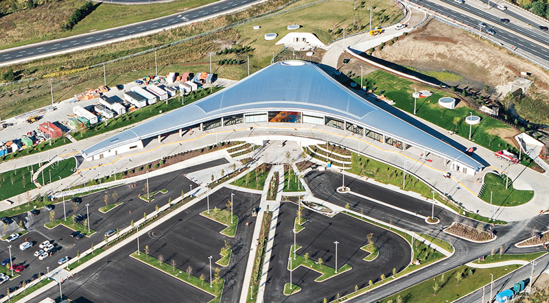
Next to Vaughan Metropolitan Centre station, cranes work to complete a YMCA, library, office tower and 3,000 new high-rise units, that together will transform the area into a dense mixed-use neighbourhood. High-quality streetscaping and new bike lanes along Highway 7 and Millway Avenue presage a level of activity that is beginning to manifest. The subway station, bus rapid transit station, and bus terminal—which share a formal language while maintaining distinct identities—are located on adjacent plazas among the emerging urban grid of streets.

Designed by Grimshaw Architects with Adamson Associates and Arup, the Vaughan subway station has a formal rigour with its grand spaces and soaring canopy. However, the resolution is problematic where the building meets the ground. The tall glass walls at the ends of the structure succeed in bringing natural light down to the concourse level, but in doing so, force the entrances to the quarter-points of the plan.
As a result, the deepest canopies end up sheltering short-term bike parking, leaving the entrances exposed, and the entrances point away from the formal pick-up and drop-off areas on the north side of the station. Many drivers are ending up in the bike lanes to the east of the station.
The remaining two stations have attracted the most criticism with regards to value. Overbuilt stations, far from major destinations and with no development potential have tested the public’s trust in officials’ ability to effectively deliver major infrastructure projects. Located between a hydroelectric corridor, expressway and the headwaters of Black Creek, Highway 407 station is not anticipated to attract any development. The at-grade bus terminal portion has been sized to serve the future 407 Transitway but is underutilized at present; it resembles a giant Polycom speaker phone, rendered in steel and glass. The three-sided canopy sits atop a massive earthworks that cleverly incorporates skylights which funnel natural light to the concourse below.
At Downsview Park, a two-sided subway station was designed to straddle the GO commuter rail line that runs perpendicular to it. However, the second GO platform is not scheduled to open for several years, leaving half of the subway station redundant. Symptomatic of the design being out of touch with its surroundings, basic sidewalks to the popular Downsview Park Merchants Market next door have not been provided.

Toronto’s transit network continues to grow. The city currently has three subway lines in the planning stages and a number of LRT projects in the works. These projects will shape the city for decades to come. As debates rage regarding which line to prioritize or what mode to employ, we run the risk of losing sight of what is important. In this context, the successes and shortfalls of the Toronto-York Spadina Subway Extension offer many lessons for designers and politicians alike. Good transit design must start with an approach that puts the passenger first. Stations must connect major destinations and provide access to key interchanges. Standardized amenities offer equitable levels of comfort, while unique station designs respond to ridership levels and local context. When these elements align, stations can be safe, efficient and delightful. While low-ridership stations make for easy targets, residents of Toronto’s inner suburbs are equally deserving of high-quality transit that ennobles the daily commute.
Paul Kulig is the Urban Design and Transit Principal at Perkins+Will’s Toronto office.