The Resident Evil logo starts out as bold and straight, feeling surprisingly modern, especially for an old horror game. Then, around Resident Evil 4, things get a little… wacky. Though the typeface is all lowercase, and that’s pretty modern, so fair enough.
After that, Capcom goes back to basics with a big, all-caps logo for the latest remakes. It’s an interesting history, so be sure to see them all down below. We’ve also got Resident Evil virus, Resident Evil Rebecca, Resident Evil Sherry, and Resident Evil Sheva for even more lore to chow down on.
Anyway, let’s get typographical…
Resident Evil logo history
The original logo covers everything from the very first Resident Evil, through to Resident Evil Gaiden, plus the later-released Resident Evil: Dead Aim and some copies of Resident Evil: Outbreak and File #2. It has a wonderfully tasteful drop shadow; bold at the same time as stylish; loud and delicate at once. You can see it above.
Resident Evil Revelations and its sequel have a unique logo, while the 2008 Resident Remake and some copies of Resident Evil Zero share the same logo. Other copies of Zero, Resident Evil 4, and Resident Evil: The Umbrella Chronicles also all share the same style of logo. You can see all three above.
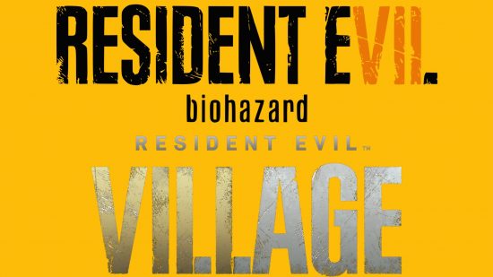
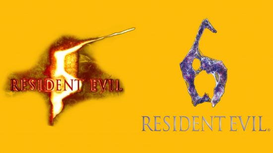
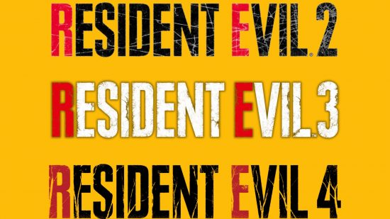
After that, Resident Evil 5, 6, Biohazard, and Village each have unique logos, though the two pairs have a similar aesthetic. You can see both above – and there’s a fun story about the RE6 logo, though it’s a little blue for PT’s liking. Lastly, the recent remakes of Resident Evil 2, 3, and 4 all share the same logo. You can see that below.
For more beyond the Resident Evil logo’s history, check out our guide to every Resident Evil movie in order, plus Resident Evil Licker, Resident Evil Tyrant, Resident Evil Carlos, and Resident Evil Hunk.
